“It’s Hard to Eval” Is a Product Smell
For the past 3 years, AI evals have been my professional focus.1 The most common objection I hear to evals is “our product is hard to eval”.
This objection is a product smell. Artifacts that are hard for you to verify are often hard for users too. In the worst case, users have to redo the work from scratch to verify the output. More importantly, designing your product for ease of verification should come before building evals.
In this post, I’ll walk through three products I advised on that faced this issue. I’ll also show before and after sketches to demonstrate design principles. After these examples, I’ll discuss how to apply this general pattern to your product.
Example 1: the AI data agent
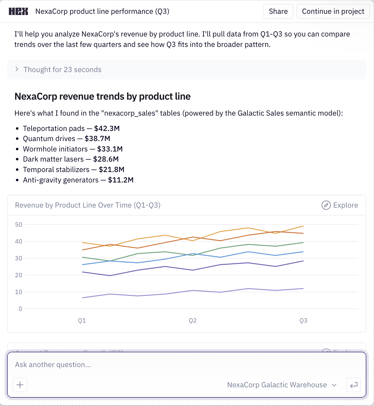
Almost every company I’ve worked with builds an internal AI data agent. You ask it a business question, like what was net revenue for Product A last quarter, and it finds relevant data sources, runs the queries, and provides an answer. The goal of this agent is to reduce dependency on data analysts.
A common mistake when building AI data agents is to make the answer the only output, as illustrated below.
In the sketch above, the user has no way to verify the answer beyond redoing work.2 A better design is to provide the user with checkable artifacts, informed by how a domain expert might validate the output. Here are techniques I use to validate metrics as a data scientist:
- Compare the quantity and any intermediate calculations against a trusted source, like a vetted dashboard or report, or a similar analysis a colleague has already vetted.3
- Confirm the metric definition precisely. A number like net revenue can include or exclude things like returns and discounts.
- Sanity-check a related quantity. If I can’t verify the number directly, I pull a related number that should move with it, like units sold or unique customers, and check if the combination is plausible.
- Look at what is beneath the aggregate. A total can hide problems, so I break it down by dimensions like region or time period and sanity-check the distribution.
- Read the query. For an important number I look at the SQL to confirm it does what I think, and I tweak it and rerun to test my assumptions.
- Note anything I could not verify. If a step has no trusted reference to check it against, I flag it instead of presenting it as settled.
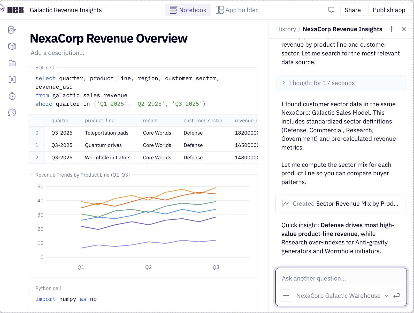
Here’s what a better interface might look like. The two tabs below show the same answer at two levels of detail. The chat reply surfaces the details worth seeing up front, and the notebook holds the full analysis behind the answer. Use the tabs to switch between them.
Details
This is the notebook the agent worked in while producing its answer. Scroll within the figure to see all the cells. The sidebar has a Contents tab for jumping between sections and an Assistant tab for asking follow-ups.
Net revenue — Product A, Q4 FY25
“What was net revenue for Product A last quarter?”
Short answer: $4.21M. This notebook shows how that number was built and what was checked against a trusted source.
1. Metric definition
Net revenue is gross − returns − discounts. Read the definition from the governed metrics layer so this matches what finance reports.
Python▶Code collapsed✦ Ask AI ⌘K
import yaml

defn = yaml.safe_load(open("metrics/net_revenue.yml"))
defn["expr"], defn["source"]
2. Net revenue for Product A
Pull net revenue for Product A for the quarter, straight from the order lines.
SQL▶Code collapsed✦ Ask AI ⌘K
SELECT SUM(gross - returns - discounts) AS net_revenue
FROM   finance.order_lines
WHERE  product = 'Product A'
  AND  fiscal_quarter = 'Q4-FY25';
| net_revenue |
|---|
| 4,210,442 |
That's the $4.21M the chat answer reported.
3. Sanity-check the distribution
Break Product A down by region, then plot it. Nothing should look out of place against last quarter's mix.
SQL▶Code collapsed✦ Ask AI ⌘K
SELECT region,
       SUM(gross - returns - discounts) AS net_revenue
FROM   finance.order_lines
WHERE  product = 'Product A'
  AND  fiscal_quarter = 'Q4-FY25'
GROUP BY region;
| region | net_revenue |
|---|---|
| West | 1,740,000 |
| Central | 1,160,000 |
| East | 890,000 |
| Intl | 420,000 |
Python▶Code collapsed✦ Ask AI ⌘K
m = by_region.set_index("region")["net_revenue"] / 1e6
m.plot.barh(title="Net revenue by region · Q4 FY25")
West and Central drive most of the revenue, with International a small tail.
4. What I could not verify
Two inputs have no trusted source to check against. Instead of treating them as settled, each is left below as a cell you can run and edit to dig in.
SQL▶Code collapsed✦ Ask AI ⌘K
-- the agent's -$0.7M returns figure is an estimate;
-- check the returns table for Q4 rows to back it
SELECT COUNT(*) AS n_rows, SUM(amount) AS returns
FROM   finance.returns
WHERE  product = 'Product A'
  AND  fiscal_quarter = 'Q4-FY25';
| n_rows | returns |
|---|---|
| 0 | NULL |
So that −$0.7M has no source to check against yet. The other open item is the customer join:
SQL▶Code collapsed✦ Ask AI ⌘K
-- 183 of 12,480 unique customers are in Billing, not CRM,
-- so some revenue can't be attributed. Pull them:
SELECT b.customer_id, b.amount
FROM   billing.invoices b
LEFT JOIN crm.customers c USING (customer_id)
WHERE  c.customer_id IS NULL
ORDER BY b.amount DESC
LIMIT 5;
| customer_id | amount |
|---|---|
| BIL-44821 | 18,400 |
| BIL-39105 | 12,950 |
| BIL-50277 | 9,310 |
| … | … |
That's $61,540 of revenue whose customer attribution is uncertain, surfaced so a person can resolve it before the total is trusted.
I pulled Product A's net revenue from the order lines using finance's governed definition, broke it out by region, and flagged what I couldn't verify. The cells are on the left.
There is a lot to unpack here. Here are notable changes:
- The agent optionally performs retrieval from vetted analyses, and the interface shows which one was used along with who authored it.
- There is progressive disclosure of details. The chat reply shows high value items like sources, assumptions, and issues. The user can optionally open an interactive notebook to see the full context.
- The AI-generated notebook (see notebook tab above) is organized to promote verification: it opens with the assumptions the agent made, like the metric definition and where it came from, then shows the queries it ran and the numbers they returned. It breaks the total down so you can sanity-check the distribution, and it closes with a list of what it could not verify, each item left as a cell you can run.
- The AI agent is also available in the notebook to help with follow-ups. Finally, the user can publish the notebook back to a knowledge base, where it can be retrieved by future analyses, creating a virtuous cycle.
This design sketch is far from perfect. The point is that the product should help the user verify the answer as a domain expert would. Compare it to the earlier approach, where the only output was the number.
Data agents like these are not science fiction. Hex4 is my favorite product in this genre; it integrates notebooks and chat better than anything I’ve seen. Here are screenshots from their landing page:
But what does this have to do with evals? If you design your product for verification, annotation becomes less expensive and evals will have better signals to draw from. More importantly, you’ll provide your users with a better product.
Example 2: the PE curriculum builder
A founder I advised was building an AI tool that writes physical education lesson plans for K-12 teachers. A teacher enters their constraints, like the grade they teach, how long the class is, whether it meets indoors or outdoors, and what equipment they have. The tool then writes a lesson plan for those constraints. The goal is to save teachers the time they spend planning and give them a plan that fits their class. Here is a sketch of what the product looks like:
Jog the perimeter, then dynamic stretches: arm circles, lunges, and high knees. Finish with a partner toss to warm up the hands.
Pair students and set cones 10 feet apart. Partners practice underhand throws, then overhand. Cue them to step with the opposite foot and follow through. Widen the gap as accuracy improves and rotate partners every 5 minutes.
Static stretches and a quick recap of throwing cues: step, point, follow through.
Watch for a stepped throw with the opposite foot forward and eyes on the target. Note students who need a shorter throwing distance next class.
12 cones, 6 foam balls, 3 station markers.
The founder asked me how to eval the lesson plans. I turned the question around: what does a teacher care about?
The fastest way to trust a plan is to see that a teacher like them already uses it. Additionally, teachers value visibility into what others are doing so they can learn new approaches. Therefore, a better design might start from vetted lesson plans that are actively used in schools. When the tool generates a plan, it shows which vetted plan it started from, who uses that plan, and a diff of what it changed for this teacher’s constraints.
Next, the teacher can check a small set of changes against a plan they already trust, instead of judging a whole plan from scratch. Here’s a sketch of what a better interface might look like:
In this version, most of the plan is inherited from a vetted plan. The teacher’s review is scoped to a few edits, each with a reason explaining why the change was made. This is a more efficient way to review a plan because it reduces the cognitive load of judging a whole plan from scratch.
Designing for this makes the product simpler to build. Instead of stuffing hundreds of examples into a prompt, the tool captures important dimensions, retrieves a close match, and adapts it. Automated evals now become tractable because there is less surface area to test. For example, you can verify that the plan retrieval picked a sensible anchor, and each edit honors the constraints.
Example 3: the workers-comp medical report
The last example comes from a workers’ compensation tool a founder asked me to help with. It reads a patient’s chart (intake forms, imaging reports, therapy notes, prior exams) and generates a long expert opinion report, often fifty pages or more. Here is a sketch of the product:
The claimant is a 47-year-old warehouse associate who reports a lumbar spine injury on March 3, 2025 while lifting a carton estimated at sixty pounds. He describes immediate low back pain radiating into the right lower extremity, followed by numbness along the lateral calf.
Records reviewed include the intake questionnaire, an MRI of the lumbar spine dated March 18, 2025, twelve physical therapy notes, and the treating physician's progress reports through August 2025.
On examination, lumbar flexion was limited to 40 degrees with pain. Straight leg raise was positive on the right at 50 degrees. Strength was 4 of 5 in the right extensor hallucis longus, with diminished sensation in the L5 distribution.
Lumbar disc herniation at L5-S1 with associated right L5 radiculopathy, supported by the imaging and examination findings above.
Within reasonable medical probability, the disc herniation is causally related to the industrial lifting event of March 3, 2025. The claimant had no documented history of lumbar treatment prior to that date.
The problem is the same as the other examples, but the stakes are higher. The only output is the report, and the doctor is the one accountable for it. To trust it they have to go back through the chart and confirm the facts and inferences themselves. That can take as long as writing the report from scratch, which defeats the point of the tool.
You might object that a fifty-page opinion is hard to verify. That is true, and the product should not pretend otherwise. Helping a doctor understand the evidence is arguably more valuable than the finished document. Therefore, I advised the founder to make the product work like a research assistant instead of a report generator.
For example, the product could read every record and pull out relevant facts, with a link back to the page so the doctor can check each one. Where two exams disagree, or the chart leaves a question open, the product should surface that. The doctor can then resolve any contradictions and fill in the gaps. Finally, the product can assemble the final report from what they have already checked. Here is a sketch of what this might look like:
The research assistant version of this product allows the doctor to build trust by verifying facts as they go. Similar to the other examples, this design is easier to build and evaluate. Now there are scoped units to grade, such as whether a contradiction is real or whether a citation supports a claim.
Generalizing the pattern
It is important to understand how users verify your product’s AI artifacts. Sometimes, this may require assembling supporting evidence. In other cases, it could mean refactoring the entire workflow so that the user is in the loop (like the workers’ comp example).
Below are questions that can guide your product’s design for verification:
- What does the user actually need to check?
- What trusted thing can they compare it against?
- Are there signals or heuristics that experts use to aid in verification?
- What smaller units can they accept, edit, or reject?
A common thread across these examples is provenance. The fastest way to make an output checkable is to show where each part came from, with links to see more detail. Additionally, you can use progressive disclosure so these sources don’t overwhelm the user.
What needs verifying also changes as the user’s trust grows. Early on, the data agent should make provenance obvious, like where a metric definition came from. Once the user trusts the agent gets it right, that detail can collapse by default in the card. Good design meets users where they are instead of showing everything.
These principles hold even when a product seems easy to eval. Coding is a good example: it is one of the most verifiable kinds of work, with tests, types, and diffs. Even so, some coding agents go the extra mile to make their work checkable. Cursor and Devin both record a short video of the UI changes they make, so you can confirm the work is right without reproducing it yourself.5
None of this is new
Evals thinking is aligned with good product design. Gathering supporting data and breaking down workflows into smaller units makes automated grading easier. However, I don’t want to pretend like any wisdom here is new.
All of these ideas stem from well-established design principles. For example, watching an expert work to learn what they check before you build is called needfinding.6 In research-heavy work like the medical case, there is a design goal called sensemaking, which is the work of building a structured understanding of a body of evidence you can reason over.7 There are many other concepts, but I think you get the idea.
Even though these ideas are well established, a reminder is due in the age of AI. Before AI, verification often happened incidentally during the process of creating work product. With AI, verification is the bottleneck. It is time to think about it more explicitly.
Video Walkthrough
I recorded a short video walking through these examples. If you’d rather watch than read, here it is:
Thanks to Shreya Shankar and Isaac Flath for feedback on this post.
Footnotes
The AI evals topic hub collects the rest of my evals work. I also co-teach the AI Evals for Engineers and PMs course.↩︎
Lenny Rachitsky tweeted about this recently: most of one data science team’s work is now reviewing half-baked AI analysis from PMs and engineers, and half of it is wrong.↩︎
When I worked at Airbnb we had an internal tool called the Knowledge Repo, a place where data scientists published notebooks of their deep dives on analytics, modeling, and so on (they wrote about it here). It was one of the fastest ways to get context on a new project, since you could read what someone had already worked out. I don’t know if it is still in use, but the paradigm is a good one.↩︎
Bryan Bischof led the creation of the AI at Hex. Bryan is a data scientist himself, the kind of domain expert the product serves, and I think that is part of why it is designed well.↩︎
See a demo of Cursor recording its UI changes, and Devin’s documentation on testing and recordings.↩︎
Dev Patnaik and Robert Becker, “Needfinding: The Why and How of Uncovering People’s Needs”, Design Management Journal.↩︎
Daniel M. Russell, Mark J. Stefik, Peter Pirolli, and Stuart K. Card, “The Cost Structure of Sensemaking”.↩︎